Easyviz
Easyviz is a unified interface to various packages for scientific
visualization and plotting. The Easyviz interface is written in
Python with the purpose of making it very easy to visualize data in
Python scripts. Both curve plots and more advanced 2D/3D visualization
of scalar and vector fields are supported. The Easyviz interface was
designed with three ideas in mind: 1) a simple, Matlab-like syntax; 2)
a unified interface to lots of visualization engines (called backends
later): Gnuplot, Matplotlib, Grace, Veusz, Pmw.Blt.Graph, PyX,
Matlab, VTK, VisIt, OpenDX; and 3) a minimalistic interface which
offers only basic control of plots: curves, linestyles, legends,
title, axis extent and names. More fine-tuning of plots can be done
by invoking backend-specific commands.
Easyviz was made so that one can postpone the choice of a particular
visualization package (and its special associated syntax). This is
often useful when you quickly need to visualize curves or 2D/3D fields
in your Python program, but haven’t really decided which plotting tool
to go for. As Python is gaining popularity at universities, students
are often forced to continuously switch between Matlab and Python,
which is straightforward for array computing, but (previously)
annoying for plotting. Easyviz was therefore also made to ease the
switch between Python and Matlab.
If you encounter problems with using Easyviz, please visit the
Troubleshooting chapter and the Installation chapter at the
end of the documentation.
Easyviz Documentation
The present documentation is available in a number of formats:
The documentation is written in the Doconce
format and can be translated into a number of different formats (reST,
Sphinx, LaTeX, HTML, XML, OpenOffice, RTF, Word, and plain untagged ASCII).
Guiding Principles
First principle. Array data can be plotted with a minimal
set of keystrokes using a Matlab-like syntax. A simple
t = linspace(0, 3, 51)    # 51 points between 0 and 3
y = t**2*exp(-t**2)
plot(t, y)
plots the data in (the NumPy array) t versus the data in (the NumPy
array) y. If you need legends, control of the axis, as well as
additional curves, all this is obtained by the standard Matlab-style
commands
y2 = t**4*exp(-t**2)
# pick out each 4 points and add random noise:
t3 = t[::4]
y3 = y2[::4] + random.normal(loc=0, scale=0.02, size=len(t3))

plot(t, y1, 'r-')
hold('on')
plot(t, y2, 'b-')
plot(t3, y3, 'bo')
legend('t^2*exp(-t^2)', 't^4*exp(-t^2)', 'data')
title('Simple Plot Demo')
axis([0, 3, -0.05, 0.6])
xlabel('t')
ylabel('y')
show()

hardcopy('tmp0.ps')  # this one can be included in LaTeX
hardcopy('tmp0.png') # this one can be included in HTML
Easyviz also allows these additional function calls to be executed
as a part of the plot call:
plot(t, y1, 'r-', t, y2, 'b-', t3, y3, 'bo',
     legend=('t^2*exp(-t^2)', 't^4*exp(-t^2)', 'data'),
     title='Simple Plot Demo',
     axis=(0, 3, -0.05, 0.6),
     xlabel='t', ylabel='y',
     hardcopy='tmp1.ps',
     show=True)

hardcopy('tmp0.png') # this one can be included in HTML
A scalar function  may be visualized
as an elevated surface with colors using these commands:
may be visualized
as an elevated surface with colors using these commands:
x = linspace(-2, 2, 41)  # 41 point on [-2, 2]
xv, yv = ndgrid(x, x)    # define a 2D grid with points (xv,yv)
values = f(xv, yv)       # function values
surfc(xv, yv, values,
      shading='interp',
      clevels=15,
      clabels='on',
      hidden='on',
      show=True)
Second princple. Easyviz is just a unified interface to other
plotting packages that can be called from Python. Such plotting
packages are referred to as backends. Several backends are supported:
Gnuplot, Matplotlib, Grace (Xmgr), Veusz, Pmw.Blt.Graph, PyX, Matlab,
VTK, VisIt, OpenDX. In other words, scripts that use Easyviz commands
only, can work with a variety of backends, depending on what you have
installed on the machine in question and what quality of the plots you
demand. For example, switching from Gnuplot to Matplotlib is trivial.
Scripts with Easyviz commands will most probably run anywhere since at
least the Gnuplot package can always be installed right away on any
platform. In practice this means that when you write a script to
automate investigation of a scientific problem, you can always quickly
plot your data with Easyviz (i.e., Matlab-like) commands and postpone
to marry any specific plotting tool. Most likely, the choice of
plotting backend can remain flexible. This will also allow old scripts
to work with new fancy plotting packages in the future if Easyviz
backends are written for those packages.
Third principle. The Easyviz interface is minimalistic, aimed at
rapid prototyping of plots. This makes the Easyviz code easy to read
and extend (e.g., with new backends). If you need more sophisticated
plotting, like controlling tickmarks, inserting annotations, etc., you
must grab the backend object and use the backend-specific syntax to
fine-tune the plot. The idea is that you can get away with Easyviz and
a plotting package-independent script “95 percent” of the time - only
now and then there will be demand for package-dependent code for
fine-tuning and customization of figures.
These three principles and the Easyviz implementation make simple things
simple and unified, and complicated things are not more complicated than
they would otherwise be. You can always start out with the simple
commands - and jump to complicated fine-tuning only when strictly needed.
Tutorial
This tutorial starts with plotting a single curve with a simple
plot(x,y) command. Then we add a legend, axis labels, a title, etc.
Thereafter we show how multiple curves are plotted together. We also
explain how line styles and axis range can be controlled. The
next section deals with animations and making movie files. More advanced
topics such as fine tuning of plots (using plotting package-specific
commands) and working with Axis and Figure objects close the curve
plotting part of the tutorial.
Various methods for visualization of scalar fields in 2D and 3D are
treated next, before we show how 2D and 3D vector fields can be handled.
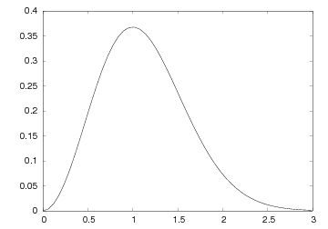
Plotting a Single Curve
Let us plot the curve  for
for
 values between 0 and 3. First we generate equally spaced
coordinates for , say 51 values (50 intervals). Then we compute the
corresponding
values between 0 and 3. First we generate equally spaced
coordinates for , say 51 values (50 intervals). Then we compute the
corresponding  values at these points, before we call the
plot(t,y) command to make the curve plot. Here is the complete
program:
values at these points, before we call the
plot(t,y) command to make the curve plot. Here is the complete
program:
from scitools.std import *

def f(t):
    return t**2*exp(-t**2)

t = linspace(0, 3, 51)    # 51 points between 0 and 3
y = zeros(len(t))         # allocate y with float elements
for i in xrange(len(t)):
    y[i] = f(t[i])

plot(t, y)
The first line imports all of SciTools and Easyviz that can be handy
to have when doing scientific computations. In this program we
pre-allocate the y array and fill it with values, element by
element, in a Python loop. Alternatively, we may operate
on the whole t array at once, which yields faster and shorter code:
from scitools.std import *

def f(t):
    return t**2*exp(-t**2)

t = linspace(0, 3, 51)    # 51 points between 0 and 3
y = f(t)                  # compute all f values at once
plot(t, y)
The f function can also be skipped, if desired, so that we can write
directly
To include the plot in electronic documents, we need a hardcopy of the
figure in PostScript, PNG, or another image format. The hardcopy
command produces files with images in various formats:
hardcopy('tmp1.eps') # produce PostScript
hardcopy('tmp1.png') # produce PNG
The filename extension determines the format: .ps or
.eps for PostScript, and .png for PNG.
Figure A simple plot in PostScript format. displays the resulting plot.
On some platforms, some backends may result in a plot that is shown in
just a fraction of a second on the screen before the plot window disappears
(using the Gnuplot backend on Windows machines or using the Matplotlib
backend constitute two examples). To make the window stay on the screen,
add
raw_input('Press the Return key to quit: ')
at the end of the program. The plot window is killed when the program
terminates, and this satement postpones the termination until the user
hits the Return key.
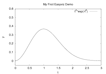
Decorating the Plot
The  and axis in curve plots should have labels, here and
, respectively. Also, the curve should be identified with a label,
or legend as it is often called. A title above the plot is also
common. In addition, we may want to control the extent of the axes (although
most plotting programs will automatically adjust the axes to the range of the
data).
All such things are easily added after the plot command:
and axis in curve plots should have labels, here and
, respectively. Also, the curve should be identified with a label,
or legend as it is often called. A title above the plot is also
common. In addition, we may want to control the extent of the axes (although
most plotting programs will automatically adjust the axes to the range of the
data).
All such things are easily added after the plot command:
xlabel('t')
ylabel('y')
legend('t^2*exp(-t^2)')
axis([0, 3, -0.05, 0.6])   # [tmin, tmax, ymin, ymax]
title('My First Easyviz Demo')
This syntax is inspired by Matlab to make the switch between
Easyviz and Matlab almost trivial.
Easyviz has also introduced a more “Pythonic” plot command where
all the plot properties can be set at once:
plot(t, y,
     xlabel='t',
     ylabel='y',
     legend='t^2*exp(-t^2)',
     axis=[0, 3, -0.05, 0.6],
     title='My First Easyviz Demo',
     hardcopy='tmp1.eps',
     show=True)
With show=False one can avoid the plot window on the screen and
just make the hardcopy. This feature is particularly useful if
one generates a large number of plots in a loop.
Note that we in the curve legend write t square as t^2 (LaTeX style)
rather than t**2 (program style). Whichever form you choose is up to
you, but the LaTeX form sometimes looks better in some plotting
programs (Gnuplot is one example).
See Figure A single curve with label, title, and axis adjusted. for what the modified
plot looks like and how t^2 is typeset in Gnuplot.
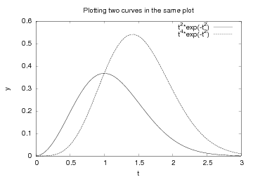
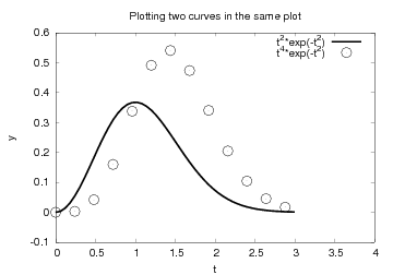
Plotting Multiple Curves
A common plotting task is to compare two or more curves, which
requires multiple curves to be drawn in the same plot.
Suppose we want to plot the two functions  and
and  . If we write two plot commands after
each other, two separate plots will be made. To make the second
plot command draw the curve in the first plot, we need to
issue a hold('on') command. Alternatively, we can provide all
data in a single plot command. A complete program illustrates the
different approaches:
. If we write two plot commands after
each other, two separate plots will be made. To make the second
plot command draw the curve in the first plot, we need to
issue a hold('on') command. Alternatively, we can provide all
data in a single plot command. A complete program illustrates the
different approaches:
from scitools.std import *   # for curve plotting

def f1(t):
    return t**2*exp(-t**2)

def f2(t):
    return t**2*f1(t)

t = linspace(0, 3, 51)
y1 = f1(t)
y2 = f2(t)

# Matlab-style syntax:
plot(t, y1)
hold('on')
plot(t, y2)

xlabel('t')
ylabel('y')
legend('t^2*exp(-t^2)', 't^4*exp(-t^2)')
title('Plotting two curves in the same plot')
hardcopy('tmp2.eps')

# alternative:
plot(t, y1, t, y2, xlabel='t', ylabel='y',
     legend=('t^2*exp(-t^2)', 't^4*exp(-t^2)'),
     title='Plotting two curves in the same plot',
     hardcopy='tmp2.eps')
The sequence of the multiple legends is such that the first legend
corresponds to the first curve, the second legend to the second curve,
and so on. The visual result appears in Figure Two curves in the same plot..
Doing a hold('off') makes the next plot command create a new
plot.
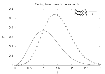
Controlling Line Styles
When plotting multiple curves in the same plot, the individual curves
get distinct default line styles, depending on the program that is
used to produce the curve (and the settings for this program). It
might well happen that you get a green and a red curve (which is bad
for a significant portion of the male population). Therefore,
we often want to control the line style in detail. Say we want the first
curve (t and y1) to be drawn as a red solid line and the second
curve (t and y2) as blue circles at the discrete data points. The
Matlab-inspired syntax for specifying line types applies a letter for
the color and a symbol from the keyboard for the line type. For
example, r- represents a red (r) line (-), while bo means blue
(b) circles (o). The line style specification is added as an
argument after the and coordinate arrays of the curve:
plot(t, y1, 'r-')
hold('on')
plot(t, y2, 'bo')

# or
plot(t, y1, 'r-', t, y2, 'bo')
The effect of controlling the line styles can be seen in
Figure Two curves in the same plot, with controlled line styles..
Assume now that we want to plot the blue circles at every 4 points only.
We can grab every 4 points out of the t array by using an appropriate
slice: t2 = t[::4]. Note that the first colon means the range from the
first to the last data point, while the second colon separates this
range from the stride, i.e., how many points we should “jump over”
when we pick out a set of values of the array.
from scitools.std import *

def f1(t):
    return t**2*exp(-t**2)

def f2(t):
    return t**2*f1(t)

t = linspace(0, 3, 51)
y1 = f1(t)
t2 = t[::4]
y2 = f2(t2)

plot(t, y1, 'r-6', t2, y2, 'bo3',
     xlabel='t', ylabel='y',
     axis=[0, 4, -0.1, 0.6],
     legend=('t^2*exp(-t^2)', 't^4*exp(-t^2)'),
     title='Plotting two curves in the same plot',
     hardcopy='tmp2.eps')
In this plot we also adjust the size of the line and the circles by
adding an integer: r-6 means a red line with thickness 6 and bo5
means red circles with size 5. The effect of the given line thickness
and symbol size depends on the underlying plotting program. For
the Gnuplot program one can view the effect in Figure Circles at every 4 points and extended line thickness (6) and circle size (3)..
- The different available line colors include
- yellow: 'y'
- magenta: 'm'
- cyan: 'c'
- red: 'r'
- green: 'g'
- blue: 'b'
- white: 'w'
- black: 'k'
- The different available line types are
- solid line: '-'
- dashed line: '--'
- dotted line: ':'
- dash-dot line: '-.'
During programming, you can find all these details in the
documentation of the plot function. Just type help(plot)
in an interactive Python shell or invoke pydoc with
scitools.easyviz.plot. This tutorial is available
through pydoc scitools.easyviz.
We remark that in the Gnuplot program all the different line types are
drawn as solid lines on the screen. The hardcopy chooses automatically
different line types (solid, dashed, etc.) and not in accordance with
the line type specification.
- Lots of markers at data points are available:
- plus sign: '+'
- circle: 'o'
- asterisk: '*'
- point: '.'
- cross: 'x'
- square: 's'
- diamond: 'd'
- upward-pointing triangle: '^'
- downward-pointing triangle: 'v'
- right-pointing triangle: '>'
- left-pointing triangle: '<'
- five-point star (pentagram): 'p'
- six-point star (hexagram): 'h'
- no marker (default): None
Symbols and line styles may be combined, for instance as in 'kx-',
which means a black solid line with black crosses at the data points.
Another Example. Let us extend the previous example with a third
curve where the data points are slightly randomly distributed around
the  curve:
from scitools.std import *

def f1(t):
    return t**2*exp(-t**2)

def f2(t):
    return t**2*f1(t)

t = linspace(0, 3, 51)
y1 = f1(t)
y2 = f2(t)

# pick out each 4 points and add random noise:
t3 = t[::4]      # slice, stride 4
random.seed(11)  # fix random sequence
noise = random.normal(loc=0, scale=0.02, size=len(t3))
y3 = y2[::4] + noise

plot(t, y1, 'r-')
hold('on')
plot(t, y2, 'ks-')   # black solid line with squares at data points
plot(t3, y3, 'bo')

legend('t^2*exp(-t^2)', 't^4*exp(-t^2)', 'data')
title('Simple Plot Demo')
axis([0, 3, -0.05, 0.6])
xlabel('t')
ylabel('y')
show()
hardcopy('tmp3.eps')
hardcopy('tmp3.png')
The plot is shown in Figure A plot with three curves..
Minimalistic Typing. When exploring mathematics in the interactive Python shell, most of us
are interested in the quickest possible commands.
Here is an example of minimalistic syntax for
comparing the two sample functions we have used in the previous examples:
t = linspace(0, 3, 51)
plot(t, t**2*exp(-t**2), t, t**4*exp(-t**2))
Text. A text can be placed at a point  using the call
More Examples. The examples in this tutorial, as well as
additional examples, can be found in the examples directory in the
root directory of the SciTools source code tree.
Interactive Plotting Sessions
All the Easyviz commands can of course be issued in an interactive
Python session. The only thing to comment is that the plot command
returns a result:
>>> t = linspace(0, 3, 51)
>>> plot(t, t**2*exp(-t**2))
[<scitools.easyviz.common.Line object at 0xb5727f6c>]
Most users will just ignore this output line.
All Easyviz commands that produce a plot return an object reflecting the
particular type of plot. The plot command returns a list of
Line objects, one for each curve in the plot. These Line
objects can be invoked to see, for instance, the value of different
parameters in the plot:
>>> line, = plot(x, y, 'b')
>>> getp(line)
{'description': '',
 'dims': (4, 1, 1),
 'legend': '',
 'linecolor': 'b',
 'pointsize': 1.0,
 ...
Such output is mostly of interest to advanced users.
Making Animations
A sequence of plots can be combined into an animation and stored in a
movie file. First we need to generate a series of hardcopies, i.e.,
plots stored in files. Thereafter we must use a tool to combine the
individual plot files into a movie file.
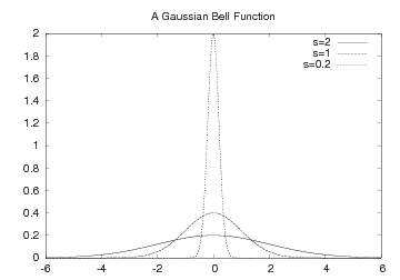
Example. The function
![f(x; m, s) = (2\pi)^{-1/2}s^{-1}\exp{\left[-{1\over2}\left({x-m\over s}\right)^2\right]}](_images/math/aac665c5f2b5c8ae4ffbfdbc8f310a92d568bba7.png) is known as the Gaussian function or the probability density function
of the normal (or Gaussian) distribution. This bell-shaped function is
“wide” for large
is known as the Gaussian function or the probability density function
of the normal (or Gaussian) distribution. This bell-shaped function is
“wide” for large  and “peak-formed” for small , see Figure
Different shapes of a Gaussian function.. The function is symmetric around
and “peak-formed” for small , see Figure
Different shapes of a Gaussian function.. The function is symmetric around  (
( in the
figure). Our goal is to make an animation where we see how this
function evolves as is decreased. In Python we implement the
formula above as a function f(x, m, s).
in the
figure). Our goal is to make an animation where we see how this
function evolves as is decreased. In Python we implement the
formula above as a function f(x, m, s).
The animation is created by varying in a loop and for each
issue a plot command. A moving curve is then visible on the screen.
One can also make a movie file that can be played as any other
computer movie using a standard movie player. To this end, each plot
is saved to a file, and all the files are combined together using some
suitable tool, which is reached through the movie function in
Easyviz. All necessary steps will be apparent in the complete program
below, but before diving into the code we need to comment upon a
couple of issues with setting up the plot command for animations.
The underlying plotting program will normally adjust the axis to the
maximum and minimum values of the curve if we do not specify the axis
ranges explicitly. For an animation such automatic axis adjustment is
misleading - the axis ranges must be fixed to avoid a jumping
axis. The relevant values for the axis range is the minimum and
maximum value of  . The minimum value is zero, while the maximum
value appears for and increases with decreasing . The range
of the axis must therefore be
. The minimum value is zero, while the maximum
value appears for and increases with decreasing . The range
of the axis must therefore be ![[0,f(m; m, \min s)]](_images/math/ebe8ab9bcb691d7b2a2acad5f660bc068d973648.png) .
.
The function is defined for all  , but the
function value is very small already
, but the
function value is very small already  away from . We may therefore
limit the coordinates to
away from . We may therefore
limit the coordinates to ![[m-3s,m+3s]](_images/math/17ce4d7454c8f455021c7d55900cfee4b4903fe8.png) .
.
Now we are ready to take a look at the complete code
for animating how the Gaussian function evolves as the parameter
is decreased from 2 to 0.2:
from scitools.std import *
import time

def f(x, m, s):
    return (1.0/(sqrt(2*pi)*s))*exp(-0.5*((x-m)/s)**2)

m = 0
s_start = 2
s_stop = 0.2
s_values = linspace(s_start, s_stop, 30)
x = linspace(m -3*s_start, m + 3*s_start, 1000)
# f is max for x=m; smaller s gives larger max value
max_f = f(m, m, s_stop)

# show the movie on the screen
# and make hardcopies of frames simultaneously:
counter = 0
for s in s_values:
    y = f(x, m, s)
    plot(x, y, axis=[x[0], x[-1], -0.1, max_f],
         xlabel='x', ylabel='f', legend='s=%4.2f' % s,
         hardcopy='tmp%04d.png' % counter)
    counter += 1
    #time.sleep(0.2)  # can insert a pause to control movie speed

# make movie file the simplest possible way:
movie('tmp*.png')
Note that the values are decreasing (linspace handles this
automatically if the start value is greater than the stop value).
Also note that we, simply because we think it is visually more
attractive, let the axis go from -0.1 although the function is
always greater than zero.
Remarks on Filenames. For each frame (plot) in the movie we store the plot in a file. The
different files need different names and an easy way of referring to
the set of files in right order. We therefore suggest to use filenames
of the form tmp0001.png, tmp0002.png, tmp0003.png, etc. The
printf format 04d pads the integers with zeros such that 1 becomes
0001, 13 becomes 0013 and so on. The expression tmp*.png will
now expand (by an alphabetic sort) to a list of all files in proper
order. Without the padding with zeros, i.e., names of the form
tmp1.png, tmp2.png, ..., tmp12.png, etc., the alphabetic order
will give a wrong sequence of frames in the movie. For instance,
tmp12.png will appear before tmp2.png.
Note that the names of plot files specified when making hardopies must
be consistent with the specification of names in the call to movie.
Typically, one applies a Unix wildcard notation in the call to
movie, say plotfile*.eps, where the asterisk will match any set of
characters. When specifying hardcopies, we must then use a filename
that is consistent with plotfile*.eps, that is, the filename must
start with plotfile and end with .eps, but in between
these two parts we are free to construct (e.g.) a frame number padded
with zeros.
We recommend to always remove previously generated plot files before
a new set of files is made. Otherwise, the movie may get old and new
files mixed up. The following Python code removes all files
of the form tmp*.png:
import glob, os
for filename in glob.glob('tmp*.png'):
    os.remove(filename)
These code lines should be inserted at the beginning of the code example
above. Alternatively, one may store all plotfiles in a subfolder
and later delete the subfolder. Here is a suitable code segment:
import shutil, os
subdir = 'temp'  # subfolder for plot files
if os.path.isdir(subdir):  # does the subfolder already exist?
    shutil.rmtree(subdir)  # delete the whole folder
os.mkdir(subdir) # make new subfolder
os.chdir(subdir) # move to subfolder
# do all the plotting
# make movie
os.chdir(os.pardir)  # optional: move up to parent folder
Movie Formats. Having a set of (e.g.) tmp*.png files, one can simply generate a movie by
a movie('tmp*.png') call. The movie function generates a movie
file called movie.avi (AVI format), movie.mpeg (MPEG format), or
movie.gif (animated GIF format) in the current working
directory. The movie format depends on the encoders found on your
machine.
You can get complete control of the movie format and the
name of the movie file by supplying more arguments to the
movie function. First, let us generate an animated GIF
file called tmpmovie.gif:
movie('tmp_*.eps', encoder='convert', fps=2,
      output_file='tmpmovie.gif')
The generation of animated GIF images applies the convert program
from the ImageMagick suite. This program must of course be installed
on the machine. The argument fps stands for frames per second so
here the speed of the movie is slow in that there is a delay of half
a second between each frame (image file).
To view the animated GIF file, one can use the animate
program (also from ImageMagick) and give the movie file as command-line
argument. One can alternatively put the GIF file in a web page
in an IMG tag such that a browser automatically displays the movie.
An AVI movie can be generated by the call
movie('tmp_*.eps', encoder='ffmpeg', fps=4,
      output_file='tmpmovie1.avi',
Alternatively, we may generate an MPEG movie using
the ppmtompeg encoder from the Netpbm suite of
image manipulation tools:
movie('tmp_*.eps', encoder='ppmtompeg', fps=24,
      output_file='tmpmovie2.mpeg',
The ppmtompeg supports only a few (high) frame rates.
The next sample call to movie uses the Mencoder tool and specifies
some additional arguments (video codec, video bitrate, and the
quantization scale):
movie('tmp_*.eps', encoder='mencoder', fps=24,
      output_file='tmpmovie.mpeg',
      vcodec='mpeg2video', vbitrate=2400, qscale=4)
Playing movie files can be done by a lot of programs. Windows Media
Player is a default choice on Windows machines. On Unix, a variety
of tools can be used. For animated GIF files the animate program
from the ImageMagick suite is suitable, or one can simply
show the file in a web page with the HTML command
<img src="tmpmovie.gif">. AVI and MPEG files can be played by,
for example, the
myplayer, vlc, or totem programs.
Advanced Easyviz Topics
The information in the previous sections aims at being sufficient for
the daily work with plotting curves. Sometimes, however, one wants to
fine-control the plot or how Easyviz behaves. First, we explain how to
set the backend. Second, we tell how to speed up the
from scitools.std import * statement. Third, we show how to operate with
the plotting program directly and using plotting program-specific
advanced features. Fourth, we explain how the user can grab Figure
and Axis objects that Easyviz produces “behind the curtain”.
Controlling the Backend. The Easyviz backend can either be set in a configuration file (see
“Setting Parameters in the Configuration File” below), by
importing a special backend in the program, or by adding a
command-line option
--SCITOOLS_easyviz_backend name
where name is the name of the backend: gnuplot, vtk,
matplotlib, etc. Which backend you choose depends on what you have
available on your computer system and what kind of plotting
functionality you want.
An alternative method is to import a specific backend in a program. Instead
of the from scitools.std import * statement one writes
from numpy import *
from scitools.easyviz.gnuplot_ import *  # work with Gnuplot
# or
from scitools.easyviz.vtk_ import *      # work with VTK
Note the trailing underscore in the module names for the various backends.
The following program prints a list of the names of the
available backends on your computer system:
from scitools.std import *
backends = available_backends()
print 'Available backends:', backends
There will be quite some output explaining the missing backends and
what must be installed to use these backends. Be prepared for exceptions
and error messages too.
Importing Just Easyviz. The from scitools.std import * statement imports many modules and packages:
from numpy import *
from scitools.numpyutils import *  # some convenience functions
from numpy.lib.scimath import *
from scipy import *                # if scipy is installed
import sys, operator, math
from scitools.StringFunction import StringFunction
from glob import glob
The scipy import can take some time and lead to slow start-up of plot
scripts. A more minimalistic import for curve plotting is
from scitools.easyviz import *
from numpy import *
Alternatively, one can edit the SciTools configuration file as
explained below in the section “Setting Parameters in the
Configuration File”.
Setting Parameters in the Configuration File. Easyviz is a subpackage of SciTools, and the the SciTools
configuration file, called scitools.cfg has several sections
([easyviz], [gnuplot], and [matplotlib]) where parameters
controlling the behavior of plotting can be set. For example, the
backend for Easyviz can be controlled with the backend parameter:
Similarly, Matplotlib’s use of LaTeX can be controlled by a boolean
parameter:
[matplotlib]
text.usetex = <bool> false
The text <bool> indicates that this is a parameter with a boolean
A configuration file with name .scitools.cfg file can be placed in
the current working folder, thereby affecting plots made in this
folder, or it can be located in the user’s home folder, which will
affect all plotting sessions for the user in question. There is also a
common SciTools config file scitools.cfg for the whole site, located
in the directory where the scitools package is installed. It is
recommended to copy the scitools.cfg, either from installation or
the SciTools source folder lib/scitools, to .scitools.cfg
in your home folder. Then you can easily control the Easyviz backend
and other paramteres by editing your local .scitools.cfg file.
Parameters set in the configuration file can also be set directly
on the command line when running a program. The name of the
command-line option is
--SCITOOLS_sectionname_parametername
where sectionname is the name of the section in the file
and parametername is the name of the
parameter. For example, setting the backend parameter in the
[easyviz] section by
--SCITOOLS_easyviz_backend gnuplot
Here is an example where we use Matplotlib as backend, turn on
the use of LaTeX in Matplotlib, and avoid the potentially slow import
of SciPy:
python myprogram.py --SCITOOLS_easyviz_backend matplotlib \
    --SCITOOLS_matplotlib_text.usetex true --SCITOOLS_scipy_load no
Working with the Plotting Program Directly. Easyviz supports just the most common plotting commands, typically the
commands you use “95 percent” of the time when exploring curves.
Various plotting packages have lots of additional commands for
different advanced features. When Easyviz does not have a command
that supports a particular feature, one can grab the Python object
that communicates with the underlying plotting program (known as
“backend”) and work with this object directly, using plotting
program-specific command syntax. Let us illustrate this principle
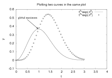
with an example where we add a text and an arrow in the plot, see
Figure Illustration of a text and an arrow using Gnuplot-specific commands..
Easyviz does not support arrows at arbitrary places inside the plot,
but Gnuplot does. If we use Gnuplot as backend, we may grab the
Gnuplot object and issue Gnuplot commands to this object
directly. Here is an example of the typical recipe, written after the
core of the plot is made in the ordinary (plotting
program-independent) way:
g = get_backend()
if backend == 'gnuplot':
    # g is a Gnuplot object, work with Gnuplot commands directly:
    g('set label "global maximum" at 0.1,0.5 font "Times,18"')
    g('set arrow from 0.5,0.48 to 0.98,0.37 linewidth 2')
    g.refresh()
    g.hardcopy('tmp2.eps')  # make new hardcopy

    g.reset()               # new plot
    data = Gnuplot.Data(t, t**3*exp(-t), with_='points 3 3',
                        title='t**3*exp(-t)')
    func = Gnuplot.Func('t**4*exp(-t)', title='t**4*exp(-t)')
    g('set tics border font "Courier,14"')
    g.plot(func, data)
For the available features and the syntax of commands, we refer to
the Gnuplot manual and the emp{demo.py} program in Python interface to
Gnuplot.
The idea advocated here is that you can quickly generate
plots with Easyviz using standard commands that are independent of
the underlying plotting package. However, when you need advanced
features, you must add plotting package-specific code as shown
above. This principle makes Easyviz a light-weight interface, but
without limiting the available functionality of various plotting programs.
The file grab_backend_demo.py in the examples folder of the
SciTools source code contains a much more comprehensive example on
fine-tuning a plot using backend-specific commands. That file shows
how this can be done in almost all the supported backends.
Working with Axis and Figure Objects. Easyviz supports the concept of Axis objects, as in Matlab.
The Axis object represents a set of axes, with curves drawn in the
associated coordinate system. A figure is the complete physical plot.
One may have several axes in one figure, each axis representing a subplot.
One may also have several figures, represented by different
windows on the screen or separate hardcopies.
Users with Matlab experience may prefer to set axis
labels, ranges, and the title using an Axis object instead of
providing the information in separate commands or as part of a plot
command. The gca (get current axis) command returns an Axis
object, whose set method can be used to set axis properties:
plot(t, y1, 'r-', t, y2, 'bo',
     legend=('t^2*exp(-t^2)', 't^4*exp(-t^2)'),
     hardcopy='tmp2.eps')

ax = gca()   # get current Axis object
ax.setp(xlabel='t', ylabel='y',
        axis=[0, 4, -0.1, 0.6],
        title='Plotting two curves in the same plot')
show()  # show the plot again after ax.setp actions
The figure() call makes a new figure, i.e., a
new window with curve plots. Figures are numbered as 1, 2, and so on.
The command figure(3) sets the current figure object to figure number
3.
Suppose we want to plot our y1 and y2 data in two separate windows.
We need in this case to work with two Figure objects:
plot(t, y1, 'r-', xlabel='t', ylabel='y',
     axis=[0, 4, -0.1, 0.6])

figure()  # new figure

plot(t, y2, 'bo', xlabel='t', ylabel='y')
We may now go back to the first figure (with the y1 data) and
set a title and legends in this plot, show the plot, and make a PostScript
version of the plot:
figure(1)  # go back to first figure
title('One curve')
legend('t^2*exp(-t^2)')
show()
hardcopy('tmp2_1.eps')
We can also adjust figure 2:
figure(2)  # go to second figure
title('Another curve')
hardcopy('tmp2_2.eps')
show()
The current Figure object is reached by gcf (get current figure),
and the dump method dumps the internal parameters in the Figure
object:
fig = gcf(); print fig.dump()
These parameters may be of interest for troubleshooting when Easyviz
does not produce what you expect.
Let us then make a third figure with two plots, or more precisely, two
axes: one with y1 data and one with y2 data.
Easyviz has a command subplot(r,c,a) for creating r
rows and c columns and set the current axis to axis number a.
In the present case subplot(2,1,1) sets the current axis to
the first set of axis in a “table” with two rows and one column.
Here is the code for this third figure:
figure()  # new, third figure
# plot y1 and y2 as two axis in the same figure:
subplot(2, 1, 1)
plot(t, y1, xlabel='t', ylabel='y')
subplot(2, 1, 2)
plot(t, y2, xlabel='t', ylabel='y')
title('A figure with two plots')
show()
hardcopy('tmp2_3.eps')
If we need to place an axis at an arbitrary position in the figure, we
must use the command
ax = axes(viewport=[left, bottom, width, height])
The four parameteres left, bottom, width, height
are location values between 0 and 1 ((0,0) is the lower-left corner
and (1,1) is the upper-right corner). However, this might be a bit
different in the different backends (see the documentation for the
backend in question).
Visualization of Scalar Fields
A scalar field is a function from space or space-time to a real value.
This real value typically reflects a scalar physical parameter at every
point in space (or in space and time). One example is temperature,
which is a scalar quantity defined everywhere in space and time. In a
visualization context, we work with discrete scalar fields that are
defined on a grid. Each point in the grid is then associated with a
scalar value.
There are several ways to visualize a scalar field in Easyviz. Both
two- and three-dimensional scalar fields are supported. In two
dimensions (2D) we can create elevated surface plots, contour plots,
and pseudocolor plots, while in three dimensions (3D) we can create
isosurface plots, volumetric slice plots, and contour slice plots.
Elevated Surface Plots
To create elevated surface plots we can use either the surf or the
mesh command. Both commands have the same syntax, but the mesh
command creates a wireframe mesh while the surf command creates a
solid colored surface.
Our examples will make use of the scalar field
 ,
where
,
where  is the distance in the plane from the origin, i.e.,
 .
The and values in our 2D domain lie between -5 and 5.
.
The and values in our 2D domain lie between -5 and 5.
The example first creates the necessary data arrays for 2D scalar
field plotting: the coordinates in each direction, extensions of these
arrays to form a ndgrid, and the function values. The latter array
is computed in a vectorized operation which requires the extended
coordinate arrays from the ndgrid function. The mesh command
can then produce the plot with a syntax that mirrors the simplicity of
the plot command for curves:
x = y = linspace(-5, 5, 21)
xv, yv = ndgrid(x, y)
values = sin(sqrt(xv**2 + yv**2))
h = mesh(xv, yv, values)
The mesh command returns a reference to a new Surface object, here
stored in a variable h. This reference can be used to set or get
properties in the object at a later stage if needed. The resulting
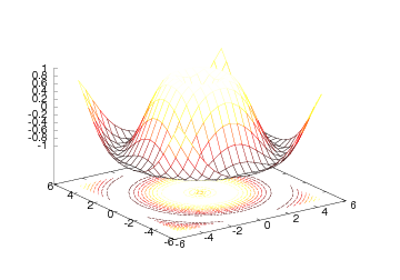
plot can be seen in Figure Result of the mesh command for plotting a 2D scalar field (Gnuplot backend)..
We remark that the computations in the previous example are vectorized.
The corresponding scalar computations using a double loop read
values = zeros(x.size, y.size)
for i in xrange(x.size):
    for j in xrange(y.size):
        values[i,j] = sin(sqrt(x[i]**2 + y[j]**2))
However, for the mesh command to work, we need the vectorized
extensions xv and yv of x and y.
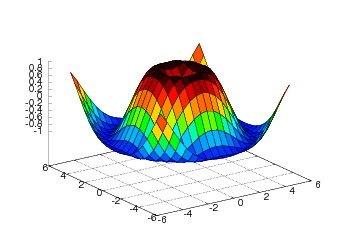
The surf command employs the same syntax, but results in a different
plot (see Figure Result of the surf command (Gnuplot backend).):
The surf command offers many possibilities to adjust the resulting plot:
setp(interactive=False)
surf(xv, yv, values)
shading('flat')
colorbar()
colormap(hot())
axis([-6,6,-6,6,-1.5,1.5])
view(35,45)
show()
Here we have specified a flat shading model, added a color bar, changed
the color map to hot, set some suitable axis values, and changed the
view point (the view takes two arguments: the azimuthal rotation and
the elevation, both given in degrees).
The same plot can also be accomplished with one single, compound
statement (just as Easyviz offers for the plot command):
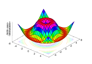
surf(xv, yv, values,
     shading='flat',
     colorbar='on',
     colormap=hot(),
     axis=[-6,6,-6,6,-1.5,1.5],
     view=[35,45])
Figure Result of an extended surf command (Gnuplot backend). displays the result.
Contour Plots
A contour plot is another useful technique for visualizing scalar
fields. The primary examples on contour plots from everyday life is
the level curves on geographical maps, reflecting the height of the
terrain. Mathematically, a contour line, also called an isoline, is
defined as the implicit curve  . The contour levels
  are
normally uniformly distributed between the extreme values of the
function (this is the case in a map: the height difference between
two contour lines is constant), but in scientific visualization it is
sometimes useful to use a few carefully selected values to
illustrate particular features of a scalar field.
are
normally uniformly distributed between the extreme values of the
function (this is the case in a map: the height difference between
two contour lines is constant), but in scientific visualization it is
sometimes useful to use a few carefully selected values to
illustrate particular features of a scalar field.
In Easyviz, there are several commands for creating different kinds of
contour plots:
contour: Draw a standard contour plot, i.e., lines in the plane.
contourf: Draw a filled 2D contour plot, where the space between
the contour lines is filled with colors.
contour3: Same as contour, but the curves are drawn at their
corresponding height levels in 3D space.
- meshc: Works in the same way as mesh except that a
contour plot is drawn in the plane beneath the mesh.
surfc: Same as meshc except that a solid surface is
drawn instead of a wireframe mesh.
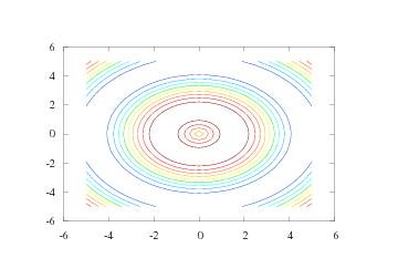
We start with illustrating the plain contour command, assuming that
we already have computed the xv, yv, and values
arrays as shown in our first example on scalar field plotting.
The basic syntax follows that of mesh and surf:
By default, five uniformly spaced contour level curves are drawn, see
Figure Result of the simplest possible contour command (Gnuplot backend)..
The number of levels in a contour plot can be specified with an additional
argument:
n = 15   # number of desired contour levels
contour(xv, yv, values, n)
The result can be seen in Figure A contour plot with 15 contour levels (Gnuplot backend)..
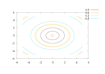
Sometimes one wants contour levels that are not equidistant or not
distributed throughout the range of the scalar field. Individual
contour levels to be drawn can easily be specified as a list:
levels = [-0.5, 0.1, 0.3, 0.9]
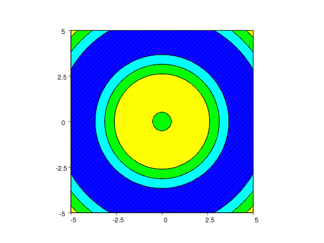
contour(xv, yv, values, levels, clabels='on')
Now, the levels list specify the values of the contour levels, and
the clabel keyword allows labeling of the level values in the plot.
Figure Four individually specified contour levels (Gnuplot backend). shows the result. We remark that the
Gnuplot backend colors the contour lines and places the contour values
and corresponding colors beside the plot. Figures that are reproduced
in black and white only can then be hard to analyze. Other backends
may draw the contour lines in black and annotate each line with the
corresponding contour level value. Such plots are better suited for
being displayed in black and white.
The contourf command,
gives a filled contour plot as shown in Figure Filled contour plot created by the contourf command (VTK backend)..
Only the Matplotlib and VTK backends currently supports filled
contour plots.
The contour lines can be “lifted up” in 3D space, as shown in Figure
Example on the contour3 command for elevated contour levels (Gnuplot backend)., using the contour3 command:
contour3(xv, yv, values, 15)
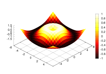
Finally, we show a simple example illustrating the meshc and surfc
commands:
meshc(xv, yv, values,
clevels=10,
colormap=hot(),
grid='off')
figure()
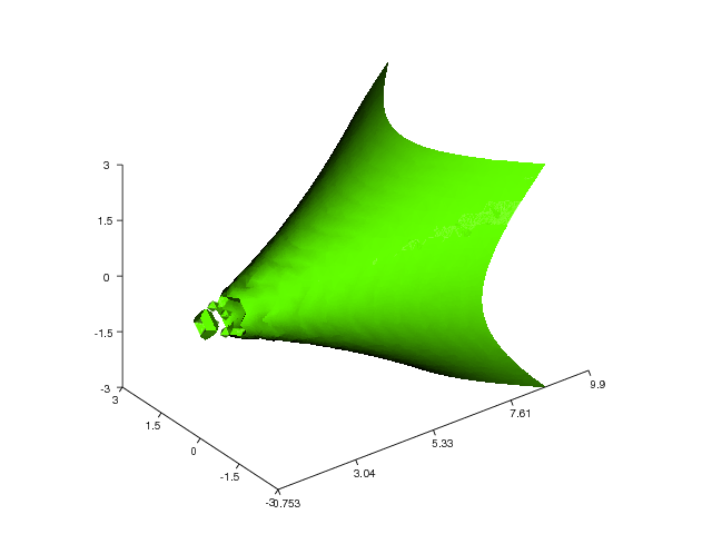
surfc(xv, yv, values,
clevels=15,
colormap=hsv(),
grid='off',
view=(30,40))
The resulting plots are displayed in Figures Wireframe mesh with contours at the bottom (Gnuplot backend). and
Surface plot with contours (Gnuplot backend)..
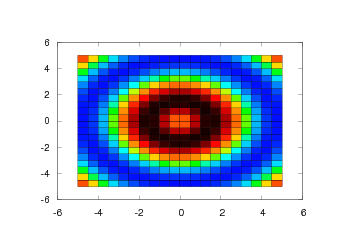
Pseudocolor Plots
Another way of visualizing a 2D scalar field in Easyviz is the
pcolor command. This command creates a pseudocolor plot, which is a
flat surface viewed from above. The simplest form of this command
follows the syntax of the other commands:
We can set the color shading in a pseudocolor plot either by giving
the shading keyword argument to pcolor or by calling the shading
command. The color shading is specified by a string that can be either
'faceted' (default), 'flat', or 'interp' (interpolated). The Gnuplot and
Matplotlib backends support 'faceted' and 'flat' only, while the
VTK backend supports all of them.
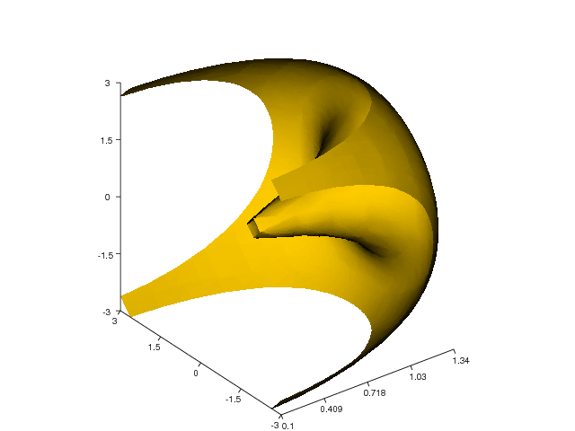
Isosurface Plots
For 3D scalar fields, isosurfaces or contour surfaces constitute the counterpart to contour
lines or isolines for 2D scalar fields. An isosurface connects points in
a scalar field with (approximately) the same scalar value and is
mathematically defined by the implicit equation  . In Easyviz,
isosurfaces are created with the isosurface command. We will
demonstrate this command using 3D scalar field data from the flow
function. This function, also found in Matlab,
generates fluid flow data. Our first isosurface visualization example
then looks as follows:
. In Easyviz,
isosurfaces are created with the isosurface command. We will
demonstrate this command using 3D scalar field data from the flow
function. This function, also found in Matlab,
generates fluid flow data. Our first isosurface visualization example
then looks as follows:
x, y, z, v = flow()  # generate fluid-flow data
setp(interactive=False)
h = isosurface(x,y,z,v,-3)
h.setp(opacity=0.5)
shading('interp')
daspect([1,1,1])
view(3)
axis('tight')
show()
After creating some scalar volume data with the flow function, we
create an isosurface with the isovalue  . The isosurface is then
set a bit transparent (opacity=0.5) before we specify the shading
model and the view point. We also set the data aspect ratio to be
equal in all directions with the daspect command. The resulting
plot is shown in Figure Isosurface plot (VTK backend).. We remark that the
Gnuplot backend does not support 3D scalar fields and hence not
isosurfaces.
. The isosurface is then
set a bit transparent (opacity=0.5) before we specify the shading
model and the view point. We also set the data aspect ratio to be
equal in all directions with the daspect command. The resulting
plot is shown in Figure Isosurface plot (VTK backend).. We remark that the
Gnuplot backend does not support 3D scalar fields and hence not
isosurfaces.
Here is another example that demonstrates the isosurface command
(again using the flow function):
x, y, z, v = flow()
setp(interactive=False)
h = isosurface(x,y,z,v,0)
shading('interp')
daspect([1,4,4])
view([-65,20])
axis('tight')
show()
Figure fig:isosurface2 shows the resulting plot.
Volumetric Slice Plot
Another way of visualizing scalar volume data is by using the slice_
command (since the name slice is already taken by a built-in
function in Python for array slicing, we have followed the standard
Python convention and added a trailing underscore to the name in
Easyviz - slice_ is thus the counterpart to the Matlab function
slice.). This command draws orthogonal slice planes through a
given volumetric data set. Here is an example on how to use the
slice_ command:
x, y, z = ndgrid(seq(-2,2,.2), seq(-2,2,.25), seq(-2,2,.16),
                   sparse=True)
v = x*exp(-x**2 - y**2 - z**2)
xslice = [-1.2, .8, 2]
yslice = 2
zslice = [-2, 0]
slice_(x, y, z, v, xslice, yslice, zslice,
       colormap=hsv(), grid='off')
Note that we here use the SciTools function seq for specifying a
uniform partitioning of an interval - the linspace function from
numpy could equally well be used. The first three arguments in the
slice_ call are the grid points in the , , and  directions. The fourth argument is the scalar field defined on-top of
the grid. The next three arguments defines either slice planes in the
three space directions or a surface plane (currently not working). In
this example we have created 6 slice planes: Three at the axis (at
directions. The fourth argument is the scalar field defined on-top of
the grid. The next three arguments defines either slice planes in the
three space directions or a surface plane (currently not working). In
this example we have created 6 slice planes: Three at the axis (at
 ,
,  , and
, and  ), one at the axis (at
  ), and two
at the axis (at
), and two
at the axis (at  and
and  ). The result is presented in
Figure Slice plot where the axis is sliced at -1.2, 0.8, and 2, the axis is sliced at 2, and the axis is sliced at -2 and 0.0 (VTK backend)..
). The result is presented in
Figure Slice plot where the axis is sliced at -1.2, 0.8, and 2, the axis is sliced at 2, and the axis is sliced at -2 and 0.0 (VTK backend)..
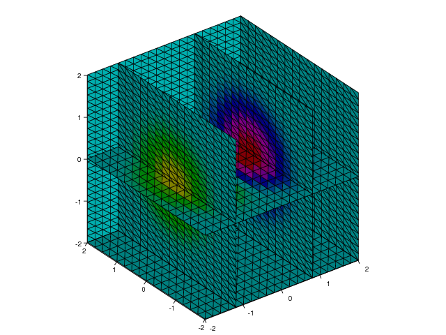
Contours in Slice Planes. With the contourslice command we can create contour plots
in planes aligned with the coordinate axes. Here is an example
using 3D scalar field data from the flow function:
x, y, z, v = flow()
setp(interactive=False)
h = contourslice(x, y, z, v, seq(1,9), [], [0], linspace(-8,2,10))
axis([0, 10, -3, 3, -3, 3])
daspect([1, 1, 1])
ax = gca()
ax.setp(fgcolor=(1,1,1), bgcolor=(0,0,0))
box('on')
view(3)
show()
The first four arguments given to contourslice in this example are
the extended coordinates of the grid (x, y, z) and the 3D scalar
field values in the volume (v). The next three arguments defines the
slice planes in which we want to draw contour lines. In this
particular example we have specified two contour plots in the planes
 , none in
  planes (empty
list) , and one contour plot in the plane
planes (empty
list) , and one contour plot in the plane  . The last argument to
contourslice is optional, it can be either an integer specifying the
number of contour lines (the default is five) or, as in the current
example, a list specifying the level curves. Running the set of
commands results in the plot shown in Figure Contours in slice planes (VTK backend)..
. The last argument to
contourslice is optional, it can be either an integer specifying the
number of contour lines (the default is five) or, as in the current
example, a list specifying the level curves. Running the set of
commands results in the plot shown in Figure Contours in slice planes (VTK backend)..
Here is another example where we draw contour slices from a
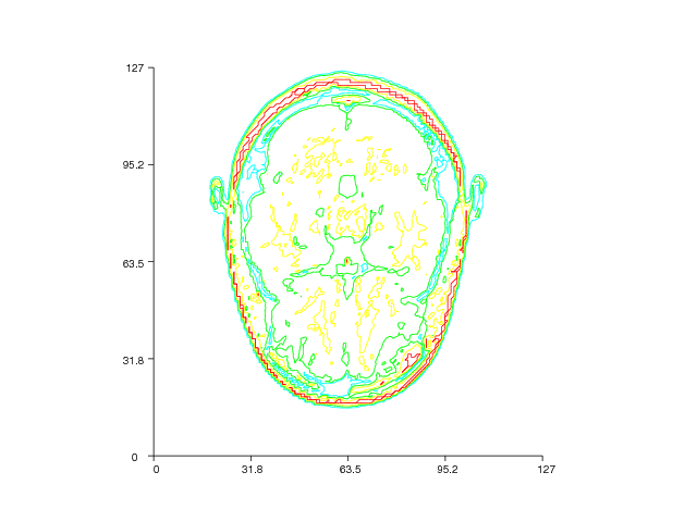
three-dimensional MRI data set:
import scipy.io
mri = scipy.io.loadmat('mri_matlab_v6.mat')
D = mri['D']
image_num = 8

# Displaying a 2D Contour Slice:
contourslice(D, [], [], image_num, daspect=[1,1,1], indexing='xy')
The MRI data set is loaded from the file mri_matlab_v6.mat with the
aid from the loadmat function available in the io module in the
SciPy package. We then create a 2D contour slice plot with one slice
in the plane  . Figure Contour slice plot of a 3D MRI data set (VTK backend). displays the result.
Visualization of Vector Fields
A vector field is a function from space or space-time to a vector
value, where the number of components in the vector corresponds to
the number of space dimensions. Primary examples on vector fields
are the gradient of a scalar field; or velocity, displacement, or
force in continuum physics.
In Easyviz, a vector field can be visualized either by a quiver
(arrow) plot or by various kinds of stream plots like stream lines,
stream ribbons, and stream tubes. Below we will look closer at each of
these visualization techniques.
Quiver Plots
The quiver and quiver3 commands draw arrows to illustrate vector
values (length and direction) at discrete points. As the names
indicate, quiver is for 2D vector fields in the plane and quiver3
plots vectors in 3D space. The basic usage of the quiver command
goes as follows:
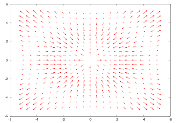
x = y = linspace(-5, 5, 21)
xv, yv = ndgrid(x, y, sparse=False)
values = sin(sqrt(xv**2 + yv**2))
uv, vv = gradient(values)
quiver(xv, yv, uv, vv)
Our vector field in this example is simply the gradient of the scalar
field used to illustrate the commands for 2D scalar field plotting.
The gradient function computes the gradient using finite difference
approximations. The result is a vector field with components uv and
vv in the and directions, respectively. The grid points and
the vector components are passed as arguments to quiver, which in
turn produces the plot in Figure Velocity vector plot (Gnuplot backend)..
The arrows in a quiver plot are automatically scaled to fit within the
grid. If we want to control the length of the arrows, we can pass an
additional argument to scale the default lengths:
scale = 2
quiver(xv, yv, uv, vv, scale)
This value of scale will thus stretch the vectors to their double length.
To turn off the automatic scaling, we can set the scale value to zero.
Quiver plots are often used in combination with other plotting
commands such as pseudocolor plots or contour plots, since this may
help to get a better perception of a given set of data. Here is an
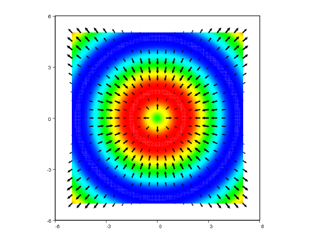
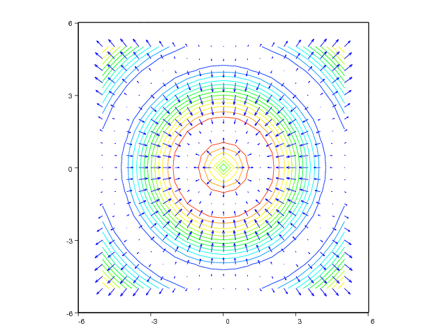
example demonstrating this principle for a simple scalar field, where
we plot the field values as colors and add vectors to illustrate the
associated gradient field:
xv, yv = ndgrid(linspace(-5,5,101), linspace(-5,5,101))
values = sin(sqrt(xv**2 + yv**2))
pcolor(xv, yv, values, shading='interp')

# create a coarser grid for the gradient field:
xv, yv = ndgrid(linspace(-5,5,21), linspace(-5,5,21))
values = sin(sqrt(xv**2 + yv**2))
uv, vv = gradient(values)
hold('on')
quiver(xv, yv, uv, vv, 'filled', 'k', axis=[-6,6,-6,6])
figure(2)
contour(xv, yv, values, 15)
hold('on')
quiver(xv, yv, uv, vv, axis=[-6,6,-6,6])
The resulting plots can be seen in Figure Combined quiver and pseudocolor plot (VTK backend). and
Combined quiver and pseudocolor plot (VTK backend)..
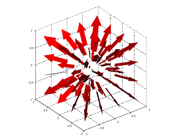
Visualization of 3D vector fields by arrows at grid points can be done
with the quiver3 command. At the time of this writing, only the VTK
backend supports 3D quiver plots. A simple example of plotting the
“radius vector field”  is given next:
x = y = z = linspace(-3,3,4)
xv, yv, zv = ndgrid(x, y, z, sparse=False)
uv = xv
vv = yv
wv = zv
quiver3(xv, yv, zv, uv, vv, wv, 'filled', 'r', axis=[-7,7,-7,7,-7,7])
The strings 'filled' and 'r' are optional and makes the arrows
become filled
and red, respectively. The resulting plot is presented in Figure
3D quiver plot (VTK backend)..
Stream Plots
Stream plots constitute an alternative to arrow plots for visualizing
vector fields. The stream plot commands currently available in
Easyviz are streamline, streamtube, and streamribbon. Stream
lines are lines aligned with the vector field, i.e., the vectors are
tangents to the streamlines. Stream tubes are similar, but now the
surfaces of thin tubes are aligned with the vectors. Stream ribbons
are also similar: thin sheets are aligned with the vectors. The latter
type of visualization is also known as stream or flow sheets. In the
near future, Matlab commands such as streamslice and
streamparticles might also be implemented.
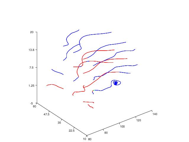
We start with an example on how to use the streamline command. In
this example (and in the following examples) we will use the wind
data set that is included with Matlab. This data set represents air
currents over a region of North America and is suitable for testing
the different stream plot commands. The following commands will load
the wind data set and then draw some stream lines from it:
import scipy.io  # needed to load binary .mat-files

# load the wind data set and create variables:
wind = scipy.io.loadmat('wind.mat')
x = wind['x']
y = wind['y']
z = wind['z']
u = wind['u']
v = wind['v']
w = wind['w']

# create starting points for the stream lines:
sx, sy, sz = ndgrid([80]*4, seq(20,50,10), seq(0,15,5),
                    sparse=False)

# draw stream lines:
streamline(x, y, z, u, v, w, sx, sy, sz,
           view=3, axis=[60,140,10,60,-5,20])
The wind data set is stored in a binary .mat-file called
wind.mat. To load the data in this file into Python, we can use the
loadmat function which is available through the io module in
SciPy. Using the loadmat function on the wind.mat-file returns a
Python dictionary (called wind in the current example) containing the NumPy
arrays x, y, z, u, v, and w. The arrays u, v, and w
are the 3D vector data, while the arrays x, y, and z defines the
(3D extended) coordinates for the associated grid. The data arrays in
the dictionary wind are then stored in seperate variables for easier
access later.
Before we call the streamline command we must set up some starting
point coordinates for the stream lines. In this example, we have used
the ndgrid command to define the starting points with the line:
sx, sy, sz = ndgrid([80]*4, seq(20,50,10), seq(0,15,5))
This command defines starting points which all lie on  ,
,
 , and
, and  . We now have all the data we need
for calling the streamline command. The first six arguments to the
streamline command are the grid coordinates (x,y,z) and the 3D
vector data (u,v,w), while the next three arguments are the starting
points which we defined with the ndgrid command above. The
resulting plot is presented in Figure Stream line plot (Vtk backend)..
. We now have all the data we need
for calling the streamline command. The first six arguments to the
streamline command are the grid coordinates (x,y,z) and the 3D
vector data (u,v,w), while the next three arguments are the starting
points which we defined with the ndgrid command above. The
resulting plot is presented in Figure Stream line plot (Vtk backend)..
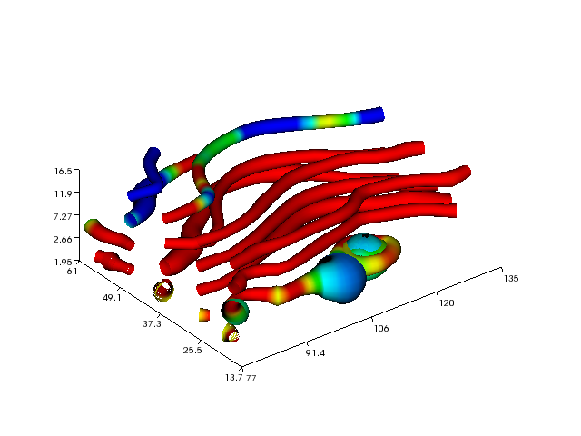
The next example demonstrates the streamtube command applied to the
same wind data set:
streamtube(x, y, z, u, v, w, sx, sy, sz,
           daspect=[1,1,1],
           view=3,
           axis='tight',
           shading='interp')
The arrays sx, sy, and sz are the same as in the previous
example and defines the starting positions for the center lines of the
tubes. The resulting plot is presented in Figure
Stream tubes (Vtk backend)..
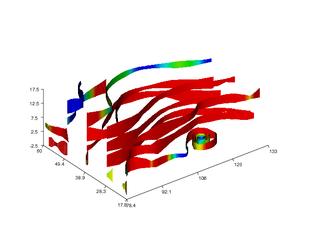
Finally, we illustrate the streamribbon command:
streamribbon(x, y, z, u, v, w, sx, sy, sz,
             ribbonwidth=5,
             daspect=[1,1,1],
             view=3,
             axis='tight',
             shading='interp')
Figure Stream ribbons (VTK backend). shows the resulting stream ribbons.
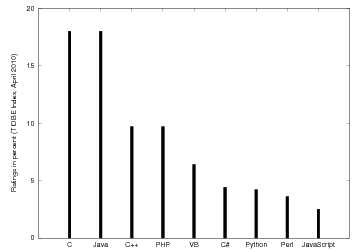
Bar Charts
Easyviz also supports a unified interface to simple bar charts.
Here is a simple example for displaying tabular values, with one
bar for each data point:
from scitools.std import *
languages = ['C', 'Java', 'C++', 'PHP', 'VB', 'C#', 'Python',
             'Perl', 'JavaScript']
ratings = [18, 18, 9.7, 9.7, 6.4, 4.4, 4.2, 3.6, 2.5]
bar(ratings, 'r',
    barticks=languages,
    ylabel='Ratings in percent (TIOBE Index, April 2010)',
    axis=[-1, len(languages), 0, 20],
    hardcopy='tmp.eps')
The bar chart illustrates the data in the ratings list. These data
correspond to the names in languages.
One may display groups of bars. The data can then be put in a matrix,
where rows (1st index) correspond to the groups the columns to the
data within one group:
data = [[ 0.15416284  0.7400497   0.26331502]
        [ 0.53373939  0.01457496  0.91874701]
        [ 0.90071485  0.03342143  0.95694934]
        [ 0.13720932  0.28382835  0.60608318]]
bar(data,
    barticks=['group 1', 'group 2', 'group 3', 'group 4'],
    legend=['bar 1', 'bar 2', 'bar 3'],
    axis=[-1, data.shape[0], 0, 1.3],
    ylabel='Normalized CPU time',
    title='Bars from a matrix, now with more annotations')
When the names of the groups (barticks) are quite long, rotating them
90 degrees is preferable, and this is done by the keyword
argument rotated_barticks=True.
The demo program in examples/bar_demo.py contains additional examples
and features.
Backends
As we have mentioned earlier, Easyviz is just a unified interface to
other plotting packages, which we refer to as backends. We have
currently implemented backends for Gnuplot, Grace, OpenDX, Matlab,
Matplotlib, Pmw.Blt, Veusz, VisIt, and VTK. Some are more early in
developement than others, like the backends for OpenDx and VisIt.
Because of limitations in many of the plotting packages, not all
features in Easyviz are supported by each of the backends. Gnuplot
has (at the time of this writing) no support for visualization of 3D
vector fields, so this is of course not available in the Gnuplot
backend either.
Some supported visualization programs are commented on below.
Gnuplot. Gnuplot is a command-driven interactive or scripted
plotting utility that works on a wide variety of platforms. Gnuplot
supports many types of plots in both 2D and 3D, including curve plots,
contour plots, vector plots, and surface plots. 3D scalar and vector
fields are not supported. To access Gnuplot from Python and send NumPy
arrays to Gnuplot, we use the Python module Gnuplot.
Matlab. Many view Matlab as the de facto standard for making curves
and plots of 2D scalar/vector fields.
Matplotlib. Matplotlib is now quickly gaining wide popularity in
the scientific Python community and has established itself as the de
facto standard for curve plotting and 2D contour and (recently) surface
plotting. The interface to Matplotlib is Matlab-insipired, and
different backends are used to create the plots: Gtk, Tk, WxWidgets
and many more. (Since Easyviz and Matplotlib haver very similar
Matlab-style syntax, Easyviz is just a thin layer on top of Matplotlib
to enable Matplotlib to be used with the Easyviz unified syntax.)
Matplotlib is now a comprehensive package with lots of tuning
possibilities that Easyviz does not support - but one can fetch the
underlying Matplotlib from Easyviz and call all the functionality of
Matplotlib directly.
Grace. Grace is a highly interactive curve plotting program on the
Unix/X11 platform which has been popular for many years. It does not
support 2D or 3D scalar or vector fields. However, it has a lot of
functionality for computing with curves and adjusting/fine-tuning
plots interactively.
PyX. PyX is a Python package for the creation of PostScript and
PDF files. It combines an abstraction of the PostScript drawing model
with a TeX/LaTeX interface. Complex tasks like 2d and 3d plots in
publication-ready quality are built out of these primitives.
Pmw.Blt.Graph. Pmw (Python Mega Widgets) extends the Tkinter
package with more sophisticated widgets, included an interactive
widget for curve plotting. This widget is based on the BLT package
(an extension of Tk written in C).
The BLT backend offers currenlty only basic plotting functionality.
Veusz. From Veusz homepage: Veusz is a
GUI scientific plotting and graphing package. It is designed to
produce publication-ready Postscript or PDF output. SVG, EMF and
bitmap formats export are also supported. Veusz has a comprehensive
GUI and produces really high-quality plots.
VTK. VTK (Visualization ToolKit) is a package primarily aimed at
visualizing 2D and 3D scalar and vector fields by a range of techniques.
VTK is used to achieve 2D and 3D visualizations of the same type as
Matlab offers. However, VTK can do much more (although the Easyviz
commands are restricted to what is typically offered by Matlab).
Troubleshooting
I Get Strange Errors Saying Something About LaTeX
You probably run Easyviz with Matplotlib as backend, and you do not
have a working LaTeX installation. Matplotlib applies LaTeX for
improved rendering of legends, titles, and numbers. The fix is to
turn off the use of LaTeX, which is done by the text.usetex
parameter in the matplotlib section of the configuration file. Set
this parameter to false. See the subsection “Setting Parameters in
the Configuration File” in the section “Advanced Easyviz Topics” in
the Easyviz tutorial. The tutorial can be reached from the code.google.com
site or by running pydoc scitools.easyviz. If you use Matplotlib as
default plotting engine, we recommend to have a .scitools.cfg
configuration file in your home folder and that use control the use
of Matplotlib parameters in this file.
Another fix of LaTeX-related problems is to switch to another backend
than Matplotlib.
Old Programs with 2D Scalar/Vector Field Plotting Do Not Work
SciTools version 0.7 changed the default backend for plotting to
Matplotlib instead of Gnuplot (provided you have Matplotlib and you
run setup.py to install SciTools - binaries for Debian still has
Gnuplot as the plotting engine). Some functionality in Gnuplot, especially
regarding 2D vector/scalar fields, is not yet present in Matplotlib
and/or supported by the Easyviz interface to Matplotlib.
You then need to explicitly run the script with Gnuplot as plottin
engine:
python myprogram.py --SCITOOLS_easyviz_backend gnuplot
or you must import gnuplot explicitly in the program:
from scitools.std import *
from scitools.easyviz.gnuplot_ import *
or you can edit the installed scitools.cfg file (“backend” keyword
in the “easyviz” section), or your local version .scitools.cfg in
your home folder, or maybe the simplest solution is to reinstall
SciTools with Gnuplot as plotting engine:
python setup.py install --easyviz_backend gnuplot
Can I Easily Turn Off All Plotting?
Yes, this is very convenient when debugging other (non-plotting) parts
of a program. Just write
from scitools.std import *
turn_off_plotting(globals())
Check Your Backends!
When you encounter a problem with Easyviz plotting, make sure that the
backend works correctly on its own (there may, e.g., be installation
problems with the backend - Easyviz just calls the backend to do the
plotting).
Gnuplot
For the Gnuplot backend you can try the following commands in a
terminal window:
Unix/DOS> gnuplot
gnuplot> plot sin(x)
This should result in a plot of the sine function on the screen.
If this command does not work, Easyviz will not work with the Gnuplot
backend. A common problem is that Gnuplot is installed, but the path
to the Gnuplot executable is not registered in the PATH environment
variable. See the section Installing Gnuplot if you need help with
installing the Gnuplot program and its Python interface.
Matplotlib
The following code tests if you have installed Matplotlib correctly:
import matplotlib.pyplot as plt
import numpy as np
x = np.linspace(0, 2*np.pi, 101)
y = np.sin(x)
plt.plot(x, y)
plt.show()
In case of problems, go to the Matplotlib source directory, remove the
build subdirectory, and try a new install with python setup.py install.
Trouble with Gnuplot and Threads
When using the Gnuplot backend, the following error may be encountered:
thread.error: can't start new thread
A remedy is to create fewer plots, and for animations, update the plot
window less frequently. For example,
for i in range(number_of_frames_in_animation):
    <prepare data>
    if i % == 100:     # plot every 100 frames
        <make plot>
Trouble with Movie Making
The call to movie demands that you have video encoders installed.
The legal encoders are mencoder, ffmpeg, mpeg_encode, ppmtompeg,
mpeg2enc, and convert. Some of these also require additional
software to be installed.
To install (e.g.) convert, you need to install the ImageMagick
software suite, since convert is a part of that package. ImageMagick
is easy to install on most platforms. The ppmtompeg encoder is a part
of the Netpbm software, while mpeg2enc is a part of mjpegtools.
On Linux Ubuntu you can issue the following installation command to install most of the available encoders for the movie function:
Unix> sudo apt-get install mencoder ffmpeg libavcodec-unstripped-51 netpbm mjpegtools imagemagick
When something goes wrong with the movie making, check the output in
the terminal window. By default, Easyviz prints the command that makes
the movie. You can manually copy this command and run it again to start
finding out what can be wrong. Just switching to a different encoder can be
a quick remedy. The switch is done with the encoder keyword argument
to movie, e.g.,
# make animated GIF movie in the file tmpmovie.gif:
movie('tmp_*.png', encoder='convert', fps=2,
      output_file='tmpmovie.gif')
I Get Thread Errors with Gnuplot
When plotting inside a loop, e.g.,
for i in some_values:
    ...
    plot(t, X0, 'r-6', axis=(0, 1, -2, 2),
         xlabel='t', ylabel='Xt', title='My Title')
Gnuplot may lead to thread errors. A remedy is to do some plotting
outside the loop and then only update the data inside the loop:
plot(t, X0, 'r-6', axis=(0, 1, -2, 2),
     xlabel='t', ylabel='Xt', title='My Title')
for i in some_values:
    ...
    plot(t, X0)
Where Can I Find Easyviz Documentation?
There is a verbose Easyviz documentation that mainly focuses on an
introduction to Easyviz (what you read now is a part of that
documentation).
Another useful source of information is the many examples that come
with the SciTools/Easyviz source code. The examples are located in
the examples subfolder of the source.
I Cannot Find Out How My Plot Can Be Created
Note that Easyviz only support the most basic types of plots:
- y=f(x) curves
- bar plots
- contour plots of 2D scalar fields
- elevated 3D surfaces of 2D scalar fields
- 3D isosurfaces of 3D scalar fields
- arrows reflecting 2D/3D vector fields
- streamlines, streamtubes, and streamribbon for 3D vector fields.
For such standard plots you can use Easyviz, otherwise you have to
use a plotting package like Matplotlib, Gnuplot, or VTK directly
from your Python program.
The following Matlab-like commands (functions) are available (but not
supported by all backends):
- autumn,
- axes,
- axis,
- bone,
- box,
- brighten,
- camdolly,
- camlight,
- camlookat,
- campos,
- camproj,
- camroll,
- camtarget,
- camup,
- camva,
- camzoom,
- caxis,
- cla,
- clabel,
- clf,
- close,
- closefig,
- closefigs,
- colorbar,
- colorcube,
- colormap,
- coneplot,
- contour,
- contour3,
- contourf,
- contourslice,
- cool,
- copper,
- daspect,
- figure,
- fill,
- fill3,
- flag,
- gca,
- gcf,
- get,
- gray,
- grid,
- hardcopy,
- hidden,
- hold,
- hot,
- hsv,
- ishold,
- isocaps,
- isosurface,
- jet,
- legend,
- light,
- lines,
- loglog,
- material,
- mesh,
- meshc,
- openfig,
- pcolor,
- pink,
- plot,
- plot3,
- prism,
- quiver,
- quiver3,
- reducevolum,
- savefig,
- semilogx,
- semilogy,
- set,
- shading,
- show,
- slice_,
- spring,
- streamline,
- streamribbon,
- streamslice,
- streamtube,
- subplot,
- subvolume,
- summer,
- surf,
- surfc,
- surfl,
- title,
- vga,
- view,
- white,
- winter,
- xlabel,
- ylabel,
- zlabel